Wix Legends: How we built a Video-First AI Digital Presence Platform
Wix Legends is a new, cutting edge initiative that introduces agentic AI personas to the Wix platform, enabling users to create, customize and deploy a live digital avatar that engages visitors in real time across synchronized video, voice, and chat. This next evolution of online presence allows creators and businesses to scale their personal brand 24/7 while fully tailoring their Legend's look, behavior, and knowledge base to effortlessly automate knowledge sharing, lead capture, FAQs and more.
Building the next evolution of online presence
Wix Legends marks a shift into a fully interactive and personal experience where your online presence isn't just a portfolio or a storefront - it’s a live, autonomous extension of your brand. It’s a huge opportunity to change how creators and businesses actually connect with people on the web.
As part of the core Wix Legends team, we were given total freedom to explore a completely unmapped territory for Wix, and I was incredibly excited to be part of this project from the ground up.
With no pre-existing Wix frameworks to follow, it was an incredible opportunity to help shape the product strategy, influence the tech stack, and design a futuristic conversational system completely from scratch as a standalone Wix offering.
Research & initial ideation
In early 2025, the team began market research and exploration of existing technologies that were available to us. We benchmarked the emerging AI landscape as well as evaluated voice and audio APIs like ElevenLabs and Hume to ground the platform. As we became more familiar with the market, we began to recognize opportunities and possible differentiators for our own solution.


We recognized that most existing products remained within their specific domains: video avatars, voice cloning, or basic persona “knowledge”. It became clear that a single holistic solution that put them all together was missing - this became our big differentiator and north star. With Wix’s established reach and understanding of the potential user base that would adopt this product, we were excited to get started.

Fully embracing conversational UI
Our ultimate goal was to give users the tools to build an interactive video avatar - a new, natural way for people to interact with AI in a more natural “face-to-face” conversation. Yet, as we began to map out the onboarding we realized that we were instinctively designing a system that didn’t adhere to these same ideas. Then it hit us: why use traditional patterns to build something that is meant to feel human? “Her” (2013), Warner Bros. Pictures
We instinctively threw out the traditional blueprint we had been using and moved to our own video and voice technology to power the creation and management flows, making the system just as conversational as the end product itself. Besides being a unique experience in today’s landscape, we would be teaching the user how it feels to interact with an AI avatar as they were creating one for themselves. We knew that this approach was ambitious and planned to measure its performance as we developed it further.
Ditching the abstract circles and humanizing the OS
We now understood that our system needed to speak and interact with the user while walking them through the experience, yet we still didn’t know how it should look, sound or feel.
Examining how today's AI landscape handles voice conversation shows a clear pattern of abstract shapes and pulsating colors to represent AI during conversation, which to us felt cold and robotic and not the approach we wanted to take.
![]()
To break away from these sterile, faceless interfaces and create an interaction that felt distinctly human, we created "Atlas" - our own custom digital interviewer and OS designed to bring true face-to-face connection to the conversational experience. The creation of Atlas had various iterations that took us through many combinations of different voices, visual looks and most importantly communication style and tone-of-voice.
In parallel, we continued to incorporate Atlas into the system itself - giving her increasingly more capabilities such as extracting information automatically and leading the user through flows and answering questions.
![]()


Because replacing traditional flows and patterns with a more conversational system was highly experimental, we ran extensive testing and usability to optimize Atlas’s voice, pacing and demeanor so she felt natural rather than rigid and robotic.
Acting as the system’s “Onboarding” guide, Atlas had to juggle multiple skills simultaneously while keeping the user moving through the main goal we set for her:
- Introduce the platform to the user and set expectations
- Extract the required information from the user
- Answer general & specific questions about the current screen
- Facilitate a natural, personal & conversational experience
Atlas extracting information through conversation during the onboarding.
Our design risk paid off! Usability sessions and onboarding funnel data confirmed a major reduction in friction and dropoff rates compared to the original straightforward baseline. Users expressed that it was a real “wow” moment and felt unlike anything that they’ve experienced in the past.
Atlas guides users seamlessly through the entire setup flow before transitioning into the main workspace where she remains as a persistent assistant capable of modifying settings and capturing data through casual dialogue.
Designing frictionless identity cloning
Early stages of the product depended heavily on existing technologies for video cloning. The initial version required reading out scripts and sitting still through silent calibration segments which led to high failure rates, frustration and significant drop off. We quickly understood that the experience needed to go in a different direction - reducing friction and bringing the user to a “wow” moment as quickly as possible.
First iteration of video cloning, requiring reading a script and remaining silent for 1 min.
Instead of continuing to battle with the technology, we came up with an ingenious idea that helped us solve these issues and completely eliminiate the aforementioned friction points. We developed an internal process that could seamlessly create your video avatar from just a single uploaded image.


Behind the scenes, our upgraded flow takes the uploaded image and generates a high-quality and “clone-optimized” image (centering, lighting etc.) that is then automatically sent for video generation, resulting in a 100% video cloning success rate. We later added the ability for users to adjust and customize the image using generative prompts, as well as generate intent-based suggestions according to their goal (i.e. a bicycle mechanic would get a related image suggestion).


For voice cloning, Atlas would record the user seamlessly and organically during the onboarding conversation with no need to read any script. Of course, fallbacks were put in place in case the user didn’t talk (or has no mic) during onboarding.
At the end of the video cloning process, we generate a short preview of your Legend before it’s sent for full generation. This gives users the chance to see and hear their Legend and continue making changes if they want.
Preview of the user’s video clone (including voice) that was generated from a single uploaded image.
Adapting to support Custom Personas
Testing showed that many users still preferred brand characters over personal clones of themselves, so we quickly shifted our focus to accommodate creating custom personas. This required a substantial overhaul of the onboarding flow and system architecture.
A selection of a few pre-made personas that we allow users to use for their Legend.
The original onboarding and workspace were redesigned to support both options - creating yourself, or choosing from pre-made stock avatars. We created a variety of pre-made video and voice pairings, while also enabling users to generate entirely custom personas from scratch.

Voice customization - choose an existing voice or create your own.
This ultimately gave business owners full control over exactly what their Legend looks and sounds like - flexibility that proved crucial for user satisfaction and adoption.
A flexible workspace experience
What does a conversational workspace look like? This was one of the biggest questions we had to tackle for users who finish the onboarding and want to manage their Legend.We wanted to keep the great conversational experience from the onboarding inside the workspace as well, so Atlas is always 1 click away and ready to perform any action the user needs - from changing a setting, editing information or adding knowledge.
Atlas updating settings via conversation with the user.
Inner workspace pages remain accessible from the side menu at any time, allowing users to see and manually adjust all their information for full control. Since this is a completely new approach to interacting with a system, we are continuously monitoring usage to optimize the experience within the workspace.

Atlas within the workspace alongside inner-pages.
Extracting, collecting and managing knowledge
Creating your Legend’s look & feel is super fun and exciting, but we knew that adding knowledge quickly and easily was key to the success of the product, as well as showing users the actual value their Legend brings.We split our approach to 2 different methods of knowledge building: conversational and manual.

Atlas extracting knowledge from user conversation.
Conversational: Keeping true to our product ideology, we offer an interactive and conversational way to add knowledge through Atlas. By naturally talking to Atlas from within the workspace, she automatically knows when to extract information and where best to put it. Additionally, Atlas has the ability to change settings like custom instructions, behavior settings or bio information upon request.


Manual: We realized that many users have pre-existing knowledge already on hand, so we created an engine for extracting knowledge from uploaded links, files, text and images. Users simply drop in their existing assets while the system processes the materials in seconds, enabling the Legend to immediately give accurate answers to visitor questions.
Creating an improvement loop
Because the Legend speaks on the user’s behalf, giving users the ability to analyze and improve its performance was crucial for us to include. How do users know that their Legend is being helpful and bringing value to visitors?Legend owners have the ability to view conversations, see what the main conversation points were and filter by intent.

Additionally, its possible to dive into a specific conversation to see what users are interested in and how the Legend answers.

While its possible to manually view visitor conversation summaries to learn about satisfaction levels, we knew that we needed a dedicated system for improving the Legend’s answers.
The “Knowledge Gap” feature dynamically summarizes user transcripts and highlights specific knowledge gaps where the Legend lacked information. Our system weighs every user message against its relevancy and whether there is enough knowledge to answer the question. If it detects a relevant missing subject, a knowledge gap is exposed to the owner as well as example questions that triggered the gap itself.
This allows Legend owners to proactively feed the system new data based on real user needs, which in turn brings more value to the users talking to the Legend. This extremely powerful feedback loop gives the Legend owner a true feeling that the Legend represents them in the best way possible.
The End-User Experience: Talking To a Legend
Putting in the effort of creating a Legend, customizing its behavior and adding knowledge culminates with sharing your legend with your audience. We focused on giving visitors a great low-latency video experience and high conversational value.
Experiencing a video call with a Wix Legend.
Visitors can choose whether they want a video call, voice call or just a text chat (both on mobile and desktop). Besides replying in voice and text, the Legend can expose interactable widgets such as video embeds, links, files and rich-text if it recognizes the need. These widgets are a powerful differentiator for our product and bring immense value to the end user, as well as allowing the Legend owner to share more with their visitors.


What the future holds
As vibe-coding and LLMs become the new norm for retrieving information and executing tasks, its clear that the next generation of products will look entirely different than what we know today. Making these interactions feel like realistic and natural conversational experiences remains a huge and exciting challenge for us.This is why the Wix Legends team is continuing its focus on pushing the envelope further, exposing powerful integrations and adding more robust features so that your Legend can do more for you, and your users.
Wix Portfolio: AI Image Clustering
Millions of Wix users across the globe showcase their work online using beautiful portfolio sites. By constantly reviewing data and user feedback, we knew that building a portfolio is traditionally a high-friction, time consuming process - especially for new users. Creators are often overwhelmed by the manual labor of sorting through years of unorganized files and writing copy for every project.
We caught the GenAI wave early, recognizing that machine learning could solve this tedious workflow and take portfolios live in a fraction of the time. That drove us to launch AI Image Clustering in May 2024, revolutionizing our portfolio suite.

Recognizing the need
The initial setup of a portfolio site is where most users dropped off - our data showed a clear need to streamline the creation process by eliminating manual, repetitive tasks so users could see value instantly. We knew we had a unique opportunity to integrate AI seamlessly and naturally within the product - it was a chance to create a magical "wow" moment where the heavy lifting was completely done for the user, leaving them with a finished foundation they could simply tweak if they wanted to. By tackling this core user frustration at the top of our funnel, we aimed to directly boost our main product KPIs: total projects created and sites published with a portfolio.


The Solution: AI Image Clustering
To eliminate the painful sorting phase entirely, I designed a seamless setup experience within the Wix Backoffice: users can simply drop a large, completely unorganized batch of images into a single upload area with no pre-sorting required.
Our AI quickly analyzes the visual context of the images to identify relevant categories tailored specifically to portfolio sites. By combining this visual analysis with any initial description or data the user provided in the first step of the flow, the system instantly clusters the assets into distinct projects, complete with automatically generated contextual titles and descriptions.

A major hurdle we faced was designing a flow that convinced users to upload a massive project library right away, instead of them just "testing" the feature with a small batch of a few random photos.
Earning that level of user trust so early in a flow was incredibly difficult, which is why creating a seamless, low-friction upload state paired with immediate visual feedback was so critical to proving the AI’s accuracy right off the bat. Our initial approach to this was to use accurate copy, as well as allow users to go back and add more images to analyze.
At the same time, it was crucial for us to give users a strong sense of ownership despite the automated generation. To balance the AI's efficiency with human control, we integrated inline text editing and a simple drag & drop mechanism for rearranging images. Giving users this high level of flexibility right before leaving the flow was key, ensuring they could quickly make minor adjustments and finish with the most optimal, personal result.

Strong Post-Setup Demand
When we launched the first phase of this feature, we focused purely on new portfolios, meaning the clustering flow was only exposed during a user's initial onboarding setup. This was done intentionally as it was the fastest way to bring this capability to users and see how they responsed to it.We quickly began hearing from users asking to access this feature post-setup so they could continue to cluster and add more projects even after the initial creation. This feedback from our community was a strong indication that the experience wasn't just a novelty, but something that brought sustained, repeatable value to their workflow and served as a clear roadmap going forward.

Supercharging SEO with One-Click Alt Text
During our initial research and user feedback cycles, we identified another major hidden pain point: creators want their work to be discoverable, but rarely have the time or SEO know-how to write optimal Alt-text for dozens of images.Recognizing this gap, we quickly implemented and launched automated Alt-text generation alongside our new AI Image Custering feature. With a single click, users can instantly equip their entire asset library with context aware and SEO optimized descriptions. This turned a tedious optimization chore into a frictionless, one-second victory that drastically improves their site's Google search rankings.
This feature was then fully integrated in Wix’s existing SEO Wizard suite.


Moving the needle
By transforming a daunting content-management chore into a smart, automated workflow, we successfully removed one of the primary barriers to portfolio adoption. The feature significantly moved the needle for our core business metrics, resulting in a substantial lift in both projects created and the total number of live published sites utilizing Wix Portfolio and was quickly opened to all users.Wix Restaurants: Rebuilding Menus, Orders, and Reservations
Restaurants has historically been one of the top performing Wix verticals in terms of GPV, with Online Orders and Table Reservations making it part of the daily reality of running a restaurant. Over time, the apps became harder to maintain on older Wix infrastructure, so management made Restaurants a priority and green-lit a rebuild of the entire suite.
As UX team lead, I set design direction, mentored the three designers, and worked hands-on while overseeing the experience across all three apps so they felt like one product.

The company’s strong belief in our offering encouraged the team to deliver a better product with more features, capabilities and customization options. Our goal was to give existing restaurants a path forward with the workflows they depended on, while adding features that made the suite more useful and gave new restaurants a reason to choose it.
Planning the rebuild
We started with what we knew from years of working on Wix Restaurants, along with product data, support requests, and conversations with owners. Alongside improving the apps themselves, we saw a lot of room to improve how owners found and adopted them. Some owners who used Menus didn’t know Wix offered online ordering, even though Orders depended on Menus. If we could reach the right owners and show them what the apps could do for their business, we had a better chance of getting them through setup and to a first order or reservation. That was why we revisited the structure.

We weighed the discovery benefits of one app against what restaurants actually needed and the work it would take to combine the three. Some owners only wanted to publish a menu or take reservations, while others needed a combination. We opted to keep the three apps so owners could install what they needed and we could roll out the rebuild more safely. We took on the work of making the apps and their connections easier to discover as part of the funnel. Once we’d settled the structure, we used product data, support requests, and user feedback to rank what to tackle by impact and effort.
 Collection and prioritization of feedback and requests.
The UX team took part in weekly conversations with users and also led some of the sessions to gain a specific UX focus. We spoke with Restaurants users and owners who used Wix without our apps to better understand where things fell short - whether it be discoverability or missing features. We also visited a handfull of small businesses in our area to shadow staff during service to gain an in-person perspective.
 Visiting businesses to learn how they operate.
Overall, we understood that owners wanted more control over their menus, easier ways to manage stock, and additional features like modifiers and order tracking. Seeing staff work away from a computer also focused our goal to make mobile parity a priority.
From discovery to first sale
I worked with product partners across Wix to reach restaurant owners in places they already used, from signup and onboarding to the App Market, templates, and the Editor side menu. App suggestions helped owners find tools relevant to their business, while setup widgets helped them take the next steps once they’d installed the apps. We worked within different integration guidelines for Wix Editor and Wix Studio, and with teams testing how AI could suggest apps based on what a business needed.


The goal was to help more of the right owners find the apps and get through setup. We tracked installation, publishing, readiness, selling, and churn so we could see how far people got and where we were losing them. My work helped improve our top-of-funnel metrics: getting more owners through those early steps supported the broader goal of getting restaurants ready to sell and growing the payment volume they processed through Wix Restaurants.
What we rebuilt
Menus - Showcase your menu online
One direction I set with the team was to make everyday menu edits easier. Menus is a core part of Wix Restaurants, and serves as the base for online ordering if installed, so I made it a priority to get it right.
We moved editing out of separate screens and modals, and into a side panel so owners could make changes in place while keeping the rest of the menu in view. The rebuilt app gave owners more control over inventory, visibility and introduced more complex options which I worked on such as variants and shared modifiers, all with their own management options.


To increase adoption and make it easy for owners with a pre-existing menu, we created an AI menu analyzer that uses an uploaded image to generate their Wix menu automatically within seconds.
 AI menu creation - automatically generated from an image of your printed menu.
On the user-facing side, we collaborated with the on-stage team to support all the new menu capabilities and expose more customization options.


Orders - From checkout to the kitchen
The team improved almost every aspect of the Online Orders app: making it easier for staff to handle orders during service with list and board views, creating a more streamlined integration with the Menus app for quick editing, notifications, printer support and more. Owners got more control over pickup and delivery, and guests could follow their order on a tracking page that updates automatically based on the order status. We also added new support for dine-in and curbside pickup.

Kanban type view for live-service order management.


Creating a seamless integration between Online Ordering and Menus was a priority for me. We added online ordering specific features to the existing menu product so that the owner could manage everything from one familiar interface and simplifying the overall experience.
 Holistic integration between Menus & Online Ordering for streamlined management


Reservations · From booking a table to seating a guest
We rebuilt both the booking flow on the restaurant’s site and the tools staff use to manage reservations. Owners had more options to configure availability and seating, manage bookings and walk-ins, and lay out tables on a visual floor plan. We added new capabilities for reminder notifications, deposits to prevent no-shows, time slots & pacing and table combinations.

A powerful floor plan tool allows owners to have a clear overview of seating during service.
 Manual reservation editing for full control.
 Many new options to enhance reservation management.
More control for owners, more room to grow
We achieved our goal of giving restaurants a more capable and flexible suite of apps, improving how Wix supports their daily operations. It was a huge undertaking involving many people, and I’m proud to have been part of it.
Leading the UX team through that change meant keeping the bigger picture in view while staying close to the details that mattered, so that three complex apps could feel like one connected offering.
Wix Mobile: Designing a Scalable Mobile Ecosystem
Millions of Wix users create and manage their online presence by creating beautiful desktop websites that show off what they’re all about - whether it’s a booking system for classes, an online store, a blog or a restaurant, Wix has you covered. Mobile traffic has long surpassed that of desktop, which means that those users need to be able to manage their business on the go. Recognizing this great potential, this is how we planned and created the Wix mobile app.

As the Lead Product Designer for the Wix Mobile Platform Team, I was responsible for designing, building, and maintaining the core application infrastructure. The goal wasn’t just to build a standalone app, but to create a scalable foundation that all of Wix’s independent product verticals (Stores, Bookings, Events, etc.) could seamlessly integrate into.
What makes the Wix app different from Wix on the web?
We already knew that creating a mobile management app would bring immense added value to business owners, allowing them to manage on the go, but we also wanted to create value for their customers as well.
This led us to conceptualizing a mobile “member view” where members can join and see a mobile version of the business (think of a website, but in an app). This new concept resulted in both “Owners” & “Members” having a significantly different way of engaging with the business, and thus following different paths when using the app.

Owners
Use the app to create & manage their business while also engaging with their members. Owners want to be able to customize and manage their online presence while on the go, which in turn gives them incentive to invite members to join and interact.
Use the app to create & manage their business while also engaging with their members. Owners want to be able to customize and manage their online presence while on the go, which in turn gives them incentive to invite members to join and interact.
vs.
Members
Join to consume services/media or to socially engage with the community surrounding the business (i.e. store, blog, forum etc.). Members need to find value in using the app, through easily doing meaningful actions. Hopefully this experience also leads them to create their own Place (viral loop).
Join to consume services/media or to socially engage with the community surrounding the business (i.e. store, blog, forum etc.). Members need to find value in using the app, through easily doing meaningful actions. Hopefully this experience also leads them to create their own Place (viral loop).
Bringing the Wix experience to mobile
Wix has a huge and established online offering that is built for use on desktop - beginning from the business manager, then on to the website editor and finally to a finished working website.


We used Wix’s vast existing framework as the base for planning a mobile version that would encompass much of the same (and sometimes added) functionality. This process began by identifying the main root-screens of our app (Home, Inbox & Account) and then mapping out each area individually along with all the inner-capabilities. The initial mapping was done at a high level with many interations.

A closer look at the app
After settling on the structure of the app, we started diving into the main screens - testing our ideas and assumptions and re-iterating where neccessary.
Home Screen - similar to the desktop’s main screen, this is where users choose which business (or “Place”) they wish to enter. This screen works by displaying dynamic content bases on updates & notifications and shows different capabilities whether you are the Owner or Member of the specific entity.

The Dashboard - Owners can monitor and manage their business through the 2 main tabs that make up the dasboard: Overview & Manage.
The Overview tab serves valuable information in the form of widgets that can be cusomized by the owner. The Manage tab gives full access to all the user’s content according to the installed verticals & features.


The Member View - Owners can customize their Member View and invite members to join and interact with it. The Member View is similar in concept to a website - you design the layout and invite people to view it. Similarly, everything about the Member View is editable by the owner.

Customize Screen - Similar to the Wix website editor, the Customize screen allows the Owner to add, remove and arrange “Sections” (think of apps) to their Member View. Once added, Members will be able to engage with these sections.

Inbox - Shows all the users that communicate with the business from across various channels (chat, email, website chat widget). In addition chatting, the Owner can also send the user offers and links through the chat. Members can also communicate with each other if the business owner has enabled such functionality.

Account - Organizes all the settings for the user that is logged in and also shows their activity across any places they are a member in. For example, if you book a class in a business - you can see it in the Account tab.

Following these initial wireframes, we continued to iterate and expand on the various areas of the app. As we began settling on the overall structure, we moved on to more high-fidelity wireframes and initial UI concepts.


Usability testing & collecting feedback
In order to really understand how our app performed in the real world, it was clear that we needed to hear from actual users. We held various usability sessions with a variety of different users in order to hear and see how they actually use the app.
One of our best usability sessions was held at Wix’s San Francisco office, in which 30 actual users were invited to come and show us how they utilized the app for their businesses. We collected hundreds of issues, bugs, feature requests and learned a lot about what users expect from us. All this data was then sorted and prioritized, which proved to be an immensely important tool for future improvments of the app.


We continued to improve in all areas of the app, from product to design, based on the data collected. After many additional iterations and the creation of a design system, we released a stable app with immense capabilities - achieving our goal and bringing Wix to millions of users’ mobile devices. Click here for a high-level look at the app and to see the final design.
Case Study: Building a design system for the Wix mobile app
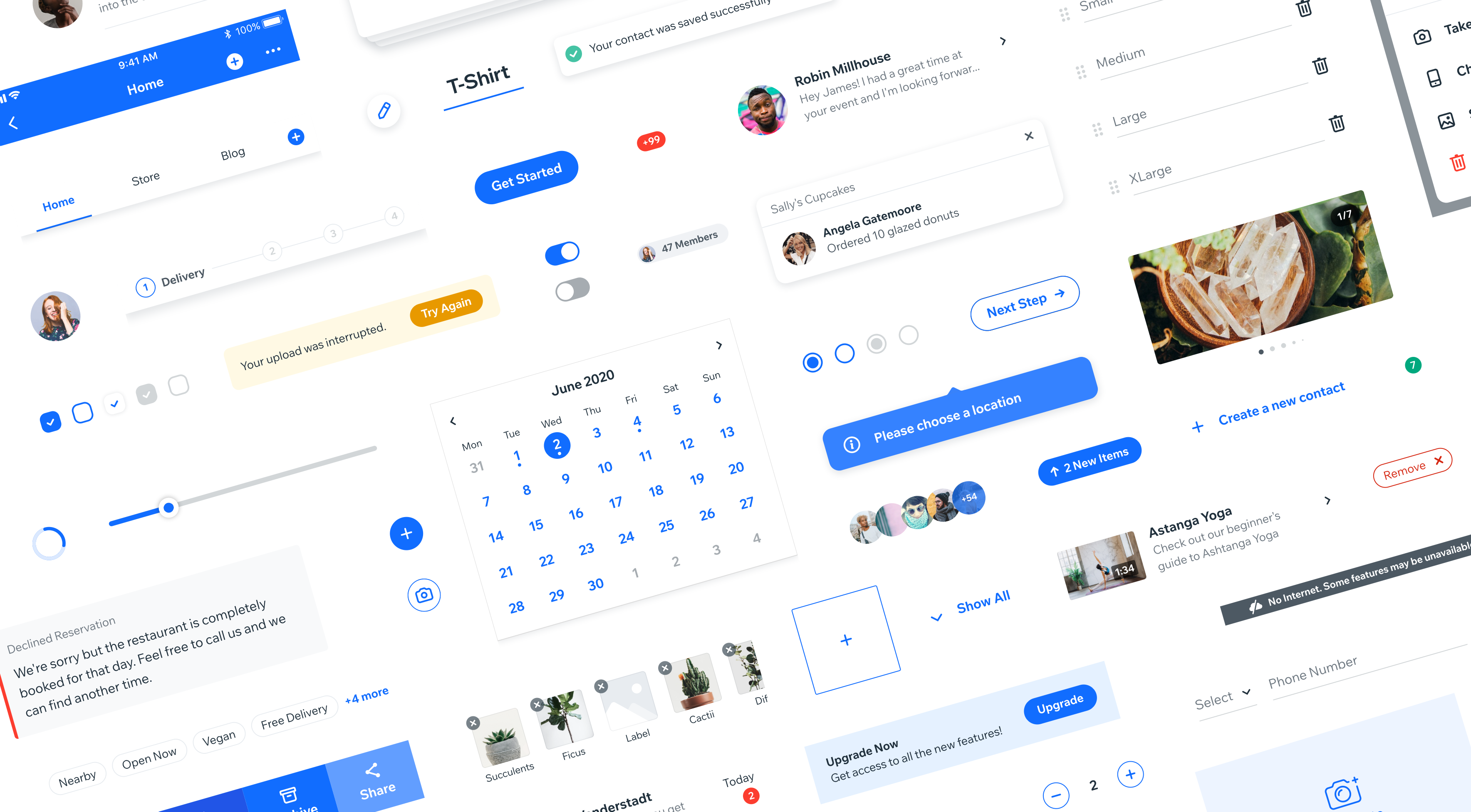
Designing for large-scale and complex projects has inevitably led to Design Systems becoming common practice in today’s leading companies - many of them adopting different variations of the concept in order to maintain design integrity and scalability across their ever-evolving products and platforms. In this case study we’ll examine how we conceptualized and created the robust design system that is used today by the Wix mobile app team.
Initially, our team had no design system in place and we relied on meetings, team-syncs and group decisions in order to maintain a cohesive UI an consistent UX patterns. While this is managable in a small team and a relatively simple product, we quickly realized that this wouldn’t be sustainable as more parts of the Wix ecosystem were being integrated into our app.

Although we were fully commited to developing using React Native, a framework designed to make such projects quicker and simpler to develop without the need for code duplication, our team was still maintaining two separate versions of the app for both iOS and Android. Every screen and flow had to be designed and QA’d for each platform which greatly hindered velocity for all teams involved.
For us designers, this meant that we had to learn and monitor all of the subtle differences in design, UX and behaviors specific for each platform. For example, we designed with San Francisco as the system font for iOS and Roboto for Android. In addition, the constant evolution of iOS’s Human Interface and Android’s Material Design demanded ongoing monitoring to make sure we were up to date with each of their design standards.

Besides the core team of 3 UX designers (at the time), we also needed to be capable of supporting ~12 other Wix verticals that were being integrated into the app in parallel - each with their own teams of designers, devoplers and PMs.
It became obvious that designing on this scale required drastic changes to be made, and luckily one of our our lead mobile developers took this monumental task head-on, with others quickly jumping on board and realizing its potential.
Research and planning
Researching how industry leading brands such as Airbnb and Spotify approached this dillemma strengthened our determination to turn our vision into a reality. We began by mapping out all of our components, from simplest to most complex, and decided on optimal guidelines for design and implementation.

From the start, I strongly believed that the key to our design system’s success was the unification of UX/UI across both platforms, allowing for a system that could be easily maintained on the design side but also the development side. To me, split designs seemed old fashioned and cumbersome, especially for apps that wish to have a more branded experience. Such a change obviously required a fair amount of convincing due to the fact that most people are very loyal to their platform of choice - believing one is superior to the other in terms of UX/UI.
Although most components would become unified, some were deliberately left “native” in order to keep the familiarity associated with each platform. Here is an example of our custom top navigation that conforms to native guidelines but uses the Wix MadeFor font and custom icons.

Some components evolved into “hybrid” versions that mixed custom elements with platform-specific ones. For example, we made our bottom tab navigation adhere to iOS and Android dimensions and spacing, but we adapted the icon styles to fit our brand and removed the textual labels.

In addition to those considerations, I believed that the Wix brand should be the prominent driving force behind our designs. Having our designs aligned to Wix’s brand would mean that our users would be benefiting from a holistic experience across Wix’s desktop & mobile products.
A Generic System Architecture
Because the app was constantly evolving, our secondary criteria for the design system was to create a flexible architecture that could adapt to future changes easily and seamlessly. Together with the lead developer we defined a generic structure upon which we would build the sytem - essentially breaking down all elements into their most atomic form. Most importantly, the most common elements like typography styles, colors, inputs and buttons would be detached from any specific context.
For example, we defined our typography styles with generic names instead of specific ones (i.e. “title” instead of “card-title”).
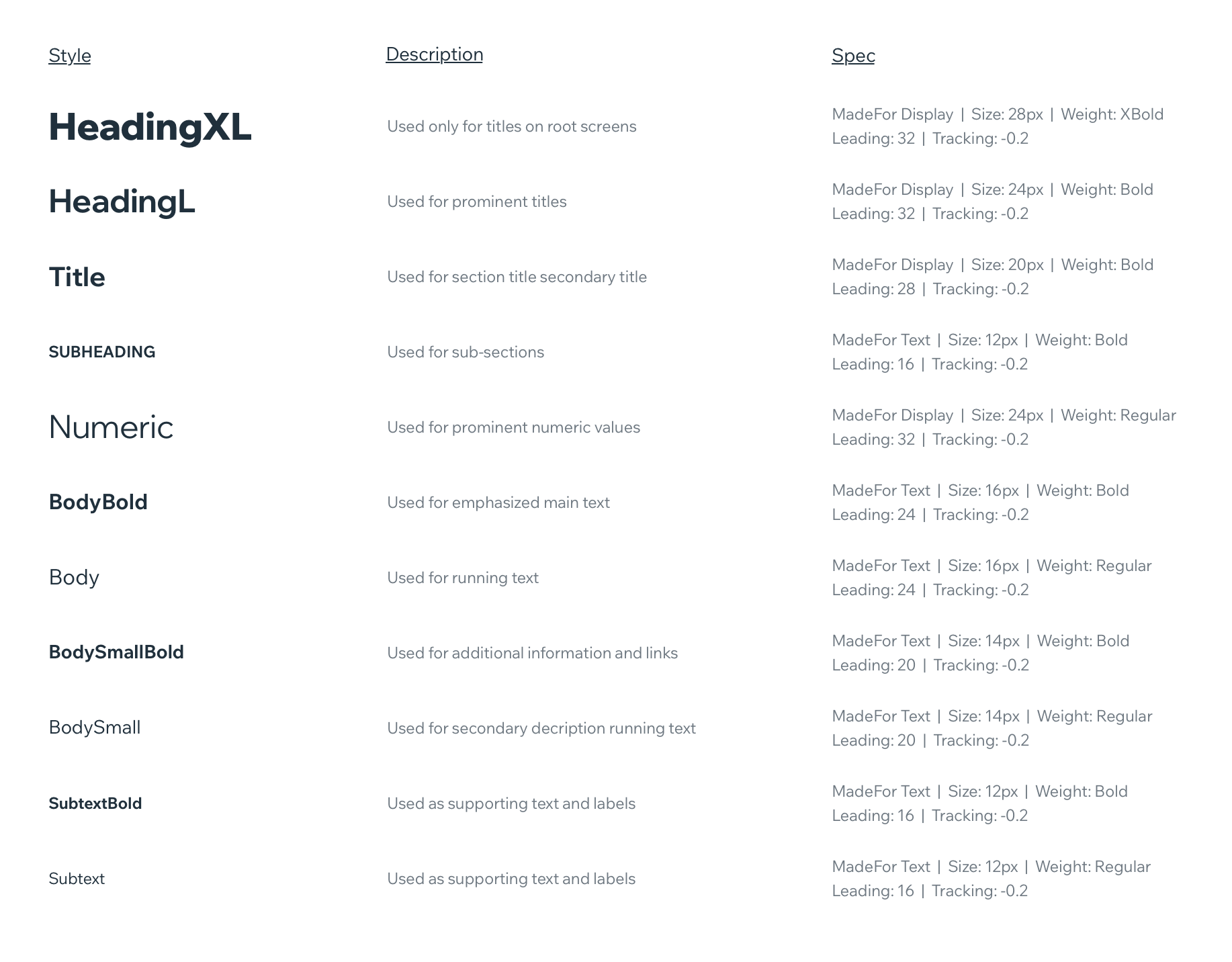
This decision proved to be key in the success of our design system. Utilizing this centralized method of control makes communication between devs and designers much simpler and most importantly enables us to make cross-app changes very easily.
Similarly, our color palette was broken down to system colors spread across several tints. This proved to be flexible enough for use but also scalable if needed for future expandability.
If we ever want to change the main color of the app, we could do it in one place and instantly change it across all components.
Besides the system colors, we automatically generate these tints for any color chosen by our user - allowing for true customization while still staying within the design system’s logic.

A system within a system
Having defined a basic system for colors, typography and spacing, we then moved on to the most basic elements such as buttons, inputs and forms since these would be the building blocks that make up more complex components and flows.
Creating new components suddenly became was simple because of the basic rules that we previously laid out. Every component that was added came with its own guidelines, specs and behavior based on any previous components it was made up from.
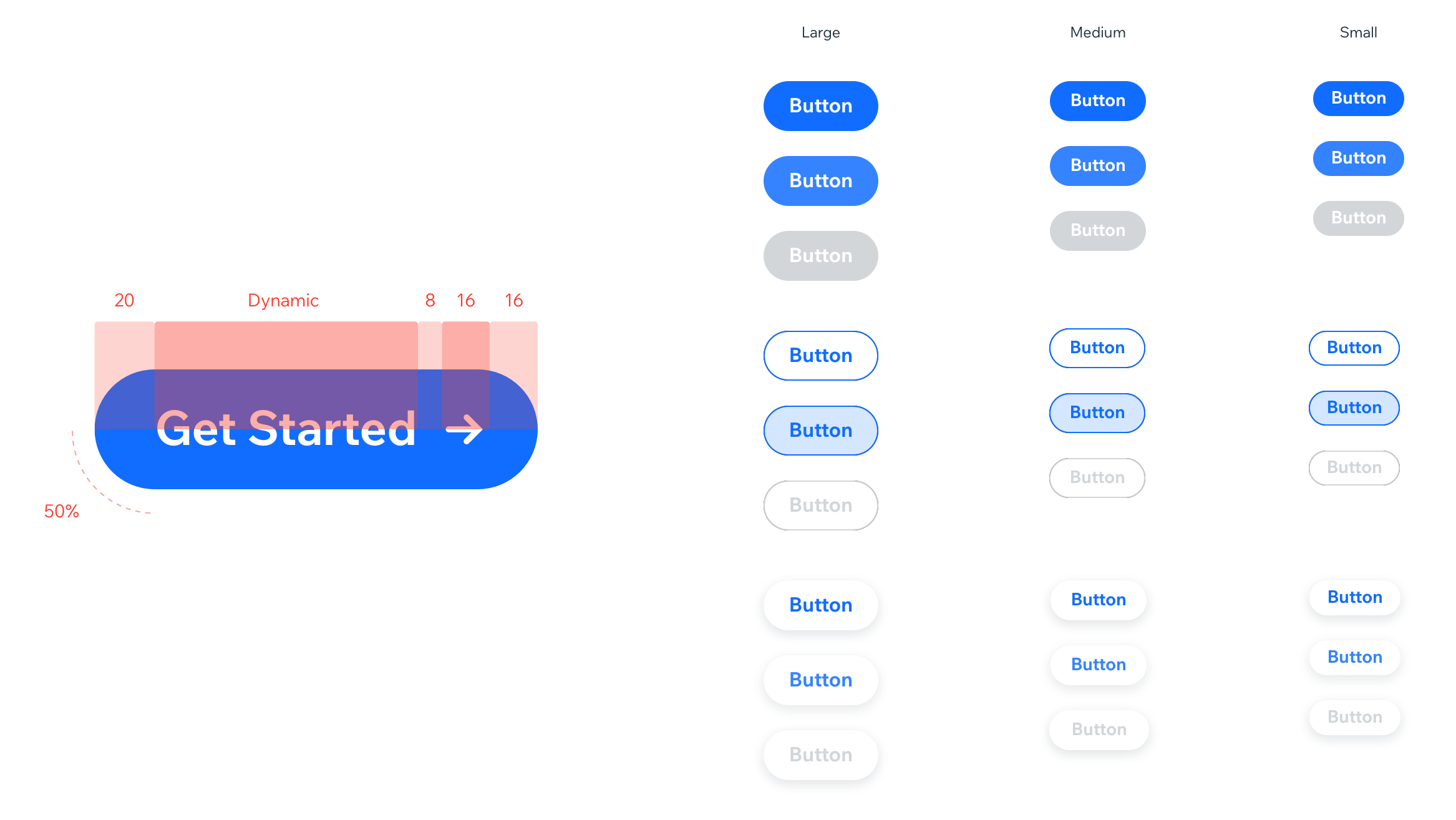
Taking a button as an example, we used our typography styles for the text, our color system to define the colors for every state and spacing presets to make sure everything could scale to different texts.
As a testiment to its success, the design system has managed to support very large-scale changes such as updating the app’s font, adding support for tablets and even things such as accessibility for the visually impaired and RTL support - instantly applying these changes and updates app-wide.
We estimate that over 90% of the app is built using components from the design system, while the remainder are custom components that have not met the criteria for being added (one-of components that are not reused by any other teams). The system has proven its power to increase velocity and consistency for all teams.

Today, the mobile design system is maintained by a dedicated team of over 10 designers and developers that support the various internal teams working in the Wix App environment. Head over here to see more about the Wix App itself.
All projects, photos & images © Copyright 2026, Roy Sherizly